Max Portal Login Screens
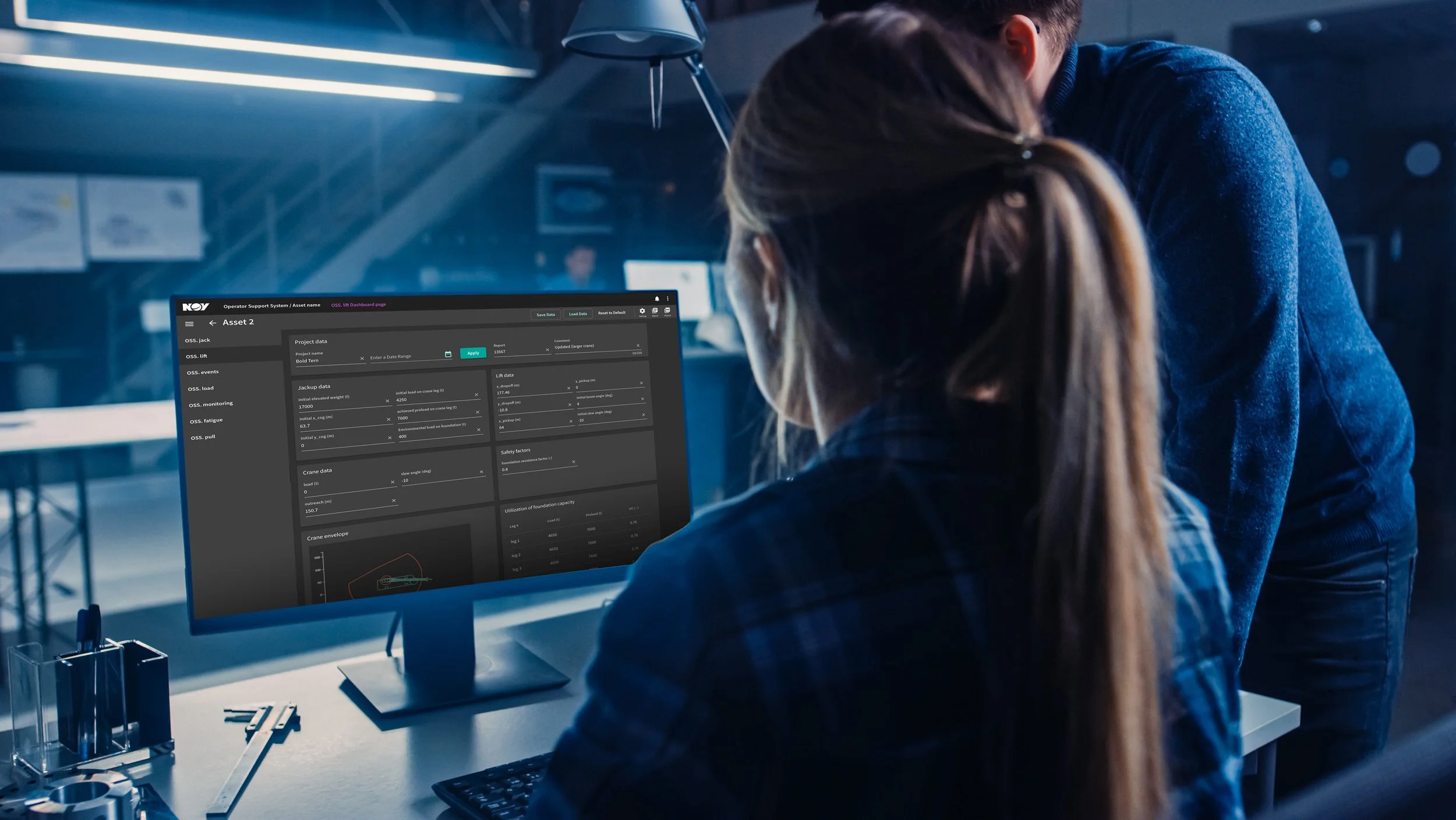
The Max Portal is the visualization interface of NOVs Max platform, a holistic suite of solutions that provide real-time data to field personnel and remote users. Max Portal was transitioning password management and multi-factor authentication to a new system named Okta, and asked the UX team for help with the transition.
My Role
As the sole UX designer on the project, I was responsible for gathering requirements, prototyping, collecting stakeholder feedback, design of the final screens, and developer handoff.
The Challenge
To design a series of user registration, login, and password recovery screens for accessing Max Portal. The screens needed to be intuitive for users to populate, include the required input fields, and also be visually consistent with the Max Platform brand. This was a fast turnaround project, and we only had a week to get the screens designed, approved, and ready for implementation.
Duration
One week
User goals and motivations:
To perform application-specific tasks
View application data
To test and review applications are working
To view product documentation
To view product manual
User needs and pain points:
Accessibility: Clear labelling for entering user information
Forgetting username or password
Recovering username or password
Having to check email for username or password recovery
Not having internet connection
Network connectivity issues
User behaviors and preferences:
Frequency of Use: Daily
Device preferences: Primary: Desktop. Occasionally mobile or tablet
Technical expertise: likely to be comfortable with complex interfaces
Security concerns: Important to user. Willing to use two-factor authentication or additional security measures
Language: English
Accessibility: Need high-contrast interface. Clear labelling for entering user information
Previous experience with website or similar: Yes
User demographics:
Age: 18-55
Gender: All
Ethnicity: Non-specific
Geographic location: Global
Education level: High school and above
User Research
Due to the time constraints, I was not able to conduct any user research.
Given the user tasks did not involve much complexity, I felt that I could make assumptions about the user's needs, motivations, and behaviors based on my own experiences and feedback from stakeholders.
Included in this set were:
Max Portal landing page
Login with username and password
Register (create login and password)
Sign In help options
Password recovery (password reset options)
Account recovery
User flow:
Based on the steps we outlined in the discovery meeting, I mapped out a user flow that contained all the functionality we had discussed. I shared the user flow with the team, and they confirmed it included everything we needed, and prompted me to move on to wireframing.
Functions
During a brainstorming meeting with stakeholders, we ideated the steps involved in the login process, then used affinity mapping to group the steps into themes and categories. Next, we prioritized the steps based on user needs and preferences. Finally, we identified which steps were most important or valuable to users and ensured that those steps were included in the task workflow. This resulted in a clear set of functions that required user flows and page designsAssumptions
Protoytpes
Once the user flows were approved, I moved on to wireframing and created two contrasting designs. One design used a large background image with user inputs in the center of the screen, and the other used the same layout, but had a solid color background.
The stakeholders liked both options and requested I design high-fidelity mockups of each. They reviewed both sets of mockups and chose the version with the color background. They felt an image would be distracting and preferred the simplicity of a solid-colored background. They requested some minor edits to the layouts, including changing the arrangement of some of the input fields, and editing the copy for some of the prompts. Once the edits were completed, they approved the updated designs, and I was ready to move on to final (high-fidelity) mockups.
Final Designs
When the final page layouts were finished, I shared them with stakeholders, and once they approved, I prepared the files for developer handoff. I held a handoff meeting with the lead developer, where I provided links to the final designs, walked him through the page layouts and functionality, and answered any questions he had so he could move on to implementation.
Take aways and Observations
Not long after delivering the final designs, we learned that there had been a misunderstanding between the stakeholders, and that we would not be able to apply our own unique theme to the login screen pages. We could use the user flow and the copy for each of the screens, but not the styling we had been hoping for.
Although it was frustrating to not use the designs I created, I was happy with the work I did in the short amount of time that we were given to complete the task.