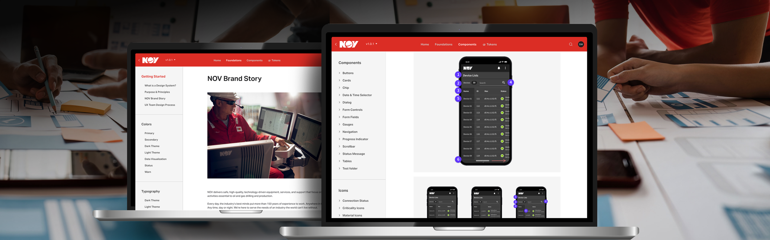

NOV Max™ Design System
Building reusable foundations for more consistent product experiences.
NOV’s digital product teams were working across multiple applications without a shared source of truth for components, visual patterns, or usage guidance. That led to inconsistent interfaces, duplicated effort, and unnecessary back-and-forth between design and development.
I was the sole designer responsible for organizing and launching a centralized design system that brought shared components, foundations, documentation, and code references into one accessible resource.
Product Designer | Design Systems | Information Architecture | UX Strategy | Cross-functional Collaboration

The Opportunity
Creating a shared source of truth for design and development.
The goal was to give product teams one place to find the latest components, visual foundations, usage guidance, and development references.
Rather than treating the design system as a static component library, I focused on creating something teams could use to design, build, review, and scale products more consistently.
Organizing the System
Making a large library easier to navigate and use.
I audited existing component libraries, gathered feedback from designers and developers, and reorganized the system around clearer foundations, components, and supporting guidance.
Research with the UX team, including questionnaires and card sorting, helped validate the information architecture and improve how assets were grouped and discovered.
The final structure brought together:
Brand and visual foundations
Reusable UI components
Usage guidelines and examples
Links to Storybook and development resources
Shared documentation for design and engineering

From Components to Guidance
Giving teams more than reusable UI.
A component library alone would not solve the consistency problem.
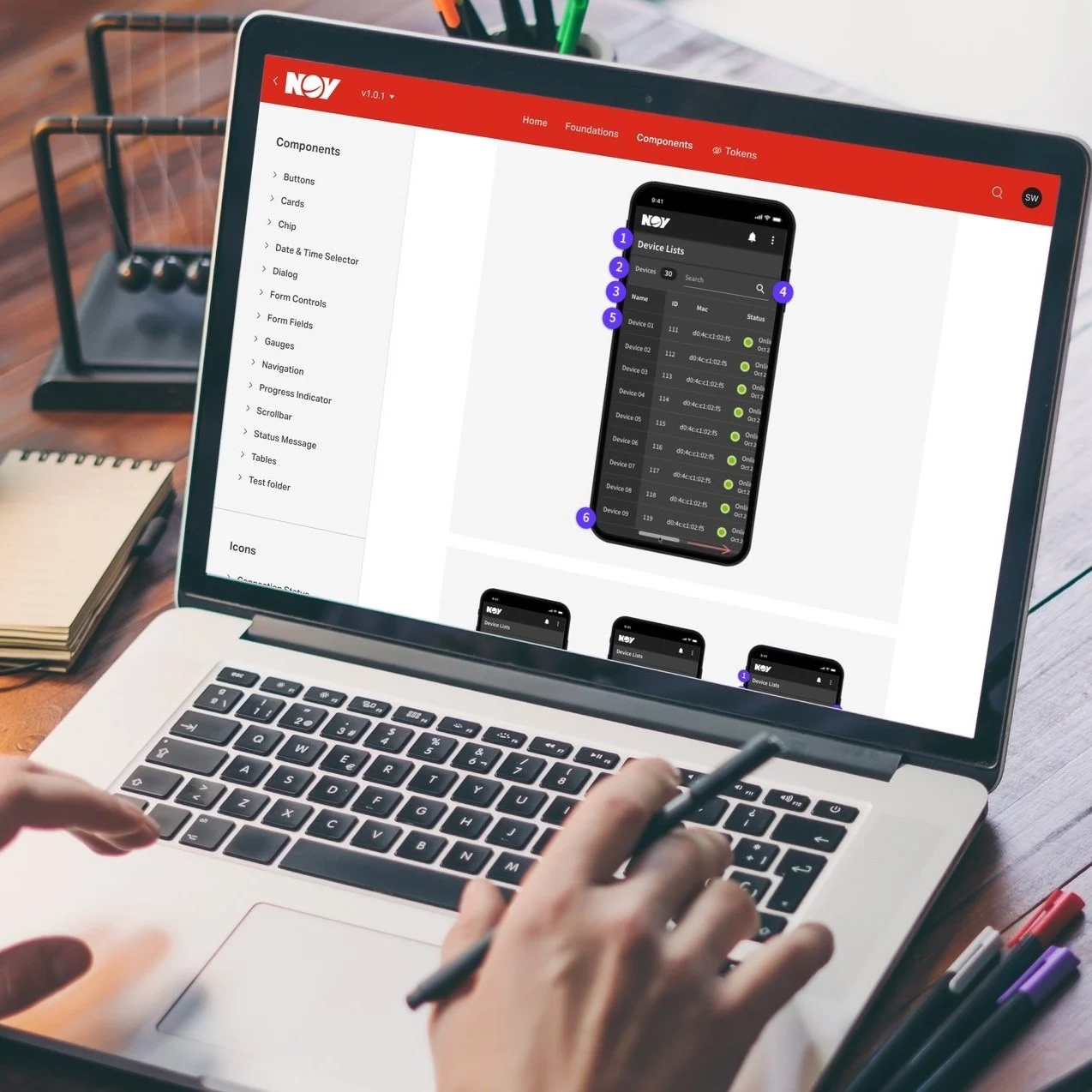
Where possible, I paired components with guidance on when and how to use them, visual examples, and direct references to corresponding development resources. This helped connect design intent with implementation and reduced ambiguity between teams.
Launching and Enabling Adoption
Helping teams understand and use the system.
Once the initial system was ready, I developed the rollout and enablement material around it.
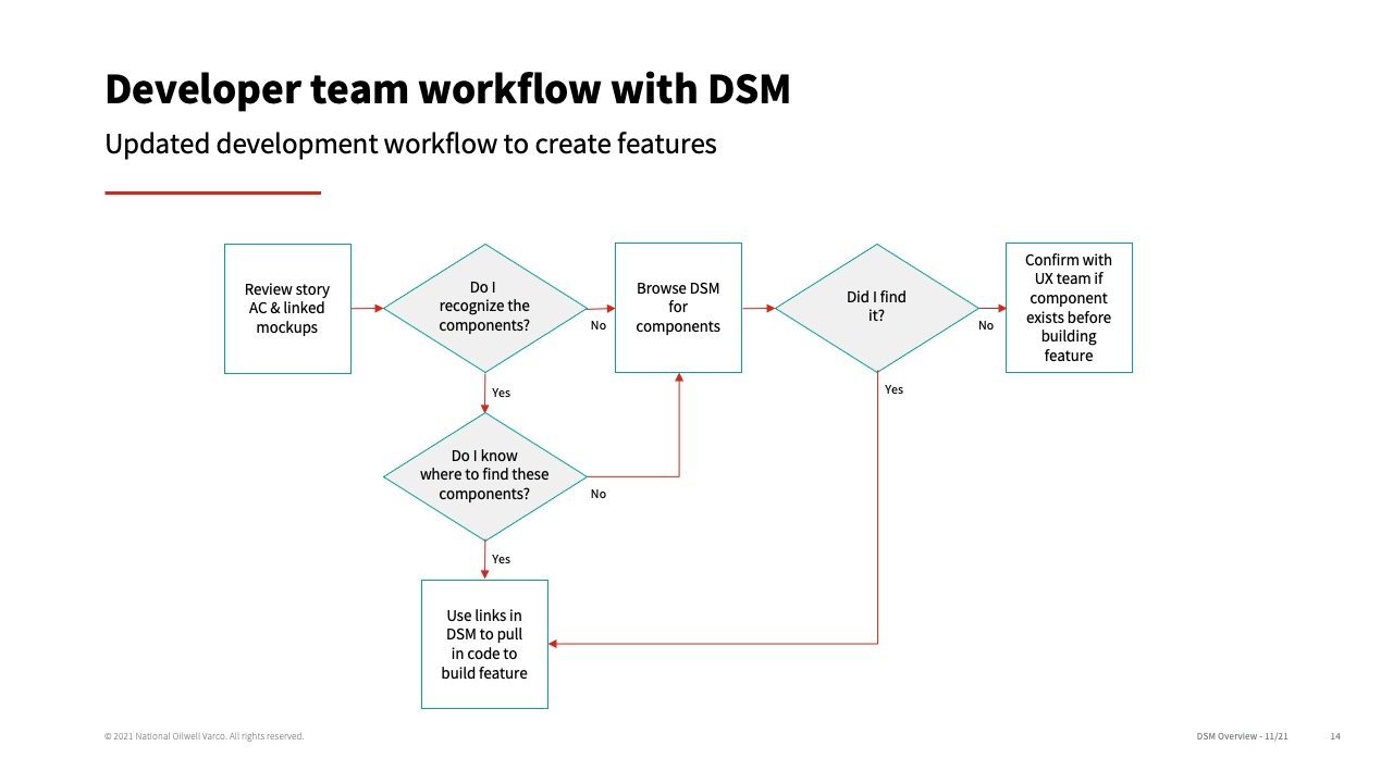
That included demonstrations, workshops, internal documentation, a recorded walkthrough, and sessions with developers so teams could understand both what was available and how it fit into their existing workflows.

Early Results
A stronger foundation for consistency
Post-launch reviews indicated that the system had met its original goals and was well received by the UX team. Designers responded positively to the organization, visual presentation, and accessibility of the usage guidance, while the shared portal created a more consistent source for current components, patterns, and code references.
The work also surfaced clear areas for future improvement, including additional documentation, missing patterns, stronger onboarding, and better communication around updates.
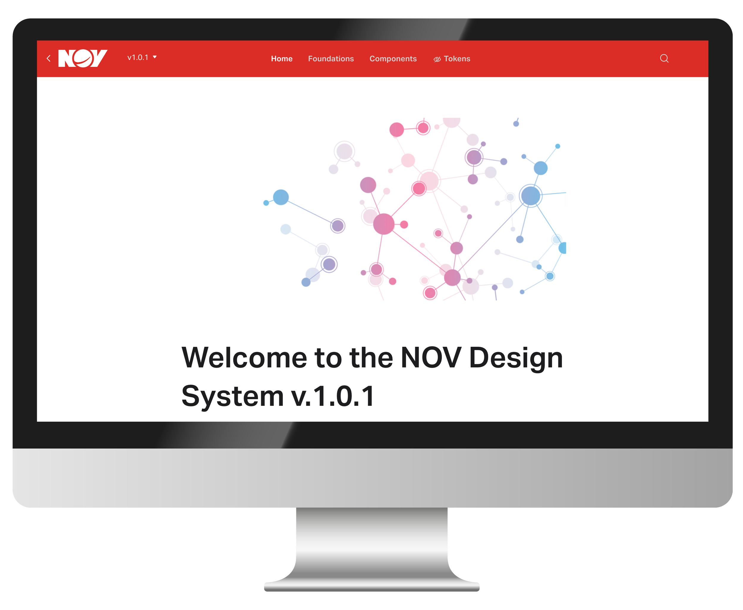
What I Took Away
A design system is only useful when teams can actually use it.
This project reinforced that design systems are not just collections of components. Their value comes from creating shared language, reducing ambiguity, and making it easier for design and engineering teams to work consistently at scale.
Consistency does not come from having more components. It comes from making the right patterns easier to find, understand, and reuse.