From Product Data to Product Decisions
Using behavioral data, AI-assisted analysis, and in-product guidance
to inform product strategy and adoption.
I established a more intentional analytics practice around MAX Completions so product and business leaders could better understand adoption, usage trends, emerging pain points, and opportunities for improvement.
By combining behavioral data from Pendo and Datadog/RUM with AI-assisted analysis and recurring reporting, I helped turn product usage into actionable insights for UX priorities, product strategy, and broader business decisions.
Product Analytics | UX Strategy | AI-Assisted Analysis | Leadership Reporting | Product Adoption
Tools | Pendo | Datadog/Realtime User Monitoring



From Signal to Decision
Connecting behavioral data, analysis, leadership discussion, and product action.
I connected analytics, reporting, product discussions, in-product guidance, and UX improvements into a broader decision-making workflow.
A behavioral signal could identify an area worth investigating. AI-assisted analysis helped me work through larger sets of usage data, compare changes over time, and surface patterns or anomalies worth deeper attention.
I then brought those findings into weekly leadership workshops, where they became inputs into product priorities, UX improvements, adoption efforts, and broader business decisions.
The goal wasn’t simply to understand what had happened. It was to turn product behavior into something the organization could act on.
DATA → ANALYSIS → INSIGHT → DECISION → ACTION → MEASUREMENT
Seeing What Users Actually Do
Using behavioral data to identify patterns worth investigating.
I used Pendo and Datadog/RUM to monitor product behavior across areas such as visitors, sessions, feature usage, engagement, and interaction patterns.
This helped me investigate questions such as:
Which parts of the product were gaining or losing engagement?
Which features were being discovered or overlooked?
Where did behavior suggest possible friction?
Which user or customer segments were changing?
What appeared to change after a product update or in-product guide?
Analytics could show what was happening. Understanding why often required customer feedback, support input, stakeholder context, and knowledge of the product.
Turning Data Into Shared Understanding
Giving leadership a clearer view of product behavior.
I created recurring reports that translated behavioral data and analysis into a more consistent view of how MAX Completions was being used.
The reports surfaced adoption patterns, feature usage, changes in engagement, customer activity, and areas that warranted deeper investigation.
I shared these findings during weekly leadership workshops, where they helped create a common evidence base for discussions about product priorities, customer behavior, feature investment, and business direction.
The reports were not simply status updates. They helped connect what was happening in the product to decisions about what deserved attention next.
Using AI to Find Patterns and Trends
Accelerating analysis without replacing product judgment.
I used AI as an analysis partner to help synthesize usage data, compare time periods, identify trends, and surface questions worth deeper investigation.
This was particularly useful when working across larger sets of product metrics and looking for changes in engagement, feature adoption, or behavior that were not immediately obvious from an individual dashboard or report.
I treated AI-generated observations as analytical starting points rather than conclusions. Findings were checked against the underlying data and interpreted in the context of the product, users, and business before being shared or acted on.
What Informed the Redesign
Combining user feedback, support insights, and behavioral data.
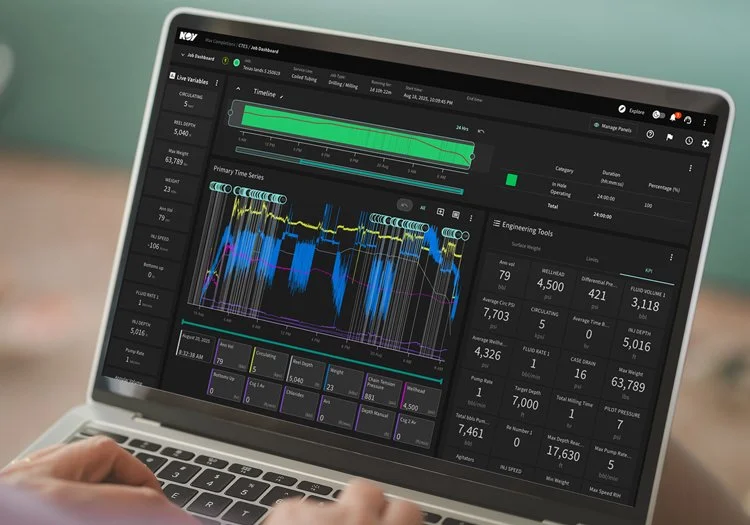
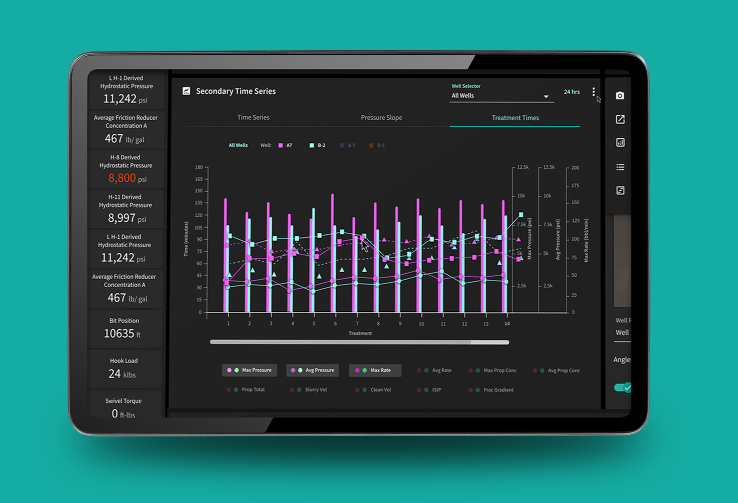
The redesign was informed by customer feedback, stakeholder and support input, user stories, questionnaires, and behavioral data from Pendo and Datadog/RUM.
I used those sources differently. Qualitative feedback helped me understand recurring needs, pain points, and operational context, while behavioral data helped identify usage patterns and areas that warranted deeper investigation.
Taken together, those inputs helped me move beyond individual feature requests and make decisions about the structure of the broader dashboard experience.
Iterating Toward the Final Experience
Refining the existing product through feedback, constraints, and ongoing review.
The dashboard evolved through ongoing reviews with product teams, stakeholders, subject-matter experts, and customers. Feedback surfaced new requirements, workflow details, and usability issues as the work progressed.
Rather than following a linear wireframe-to-final process, I refined the existing experience directly—adjusting hierarchy, layout, panel behavior, navigation, and interaction patterns as new feedback and technical constraints emerged.
This let me evaluate changes in the context of the real product and continuously balance usability improvements with the functionality experienced users already
relied on.
Outcomes
Post-launch signals showed stronger engagement and less interaction friction.

Across the 90 days after launch, unique dashboard visitors increased 17%, from 741 to 869, while average time per visitor increased from 2h 32m to 2h 58m. Other friction indicators also declined, including U-turns (−48%) and dead clicks (approximately −18%).
Customer feedback was particularly positive around the redesigned commenting experience and the new Manage Panels customization feature, which gave users more control over which dashboard areas were visible. Because other product changes occurred during the same period, I treat these as post-launch signals rather than attributing every change solely to the redesign.
Recurring feedback themes:
Users consistently highlighted easier commenting and greater control through Manage Panels, helping to keep information and communication closer to their workflow.
What I Took Away
A broader lesson in designing for complexity without oversimplifying it.
In the job dashboard, users needed to interpret dense technical information, recognize meaningful changes, and move from awareness to investigation quickly.
The broader lesson was that good UX is not always about making a product simpler. It is about making complexity easier to navigate, helping people focus on what matters, and reducing friction between information and action.
Designing complex products isn’t about removing complexity. It’s about making
the path through it clearer.